If you need a hand, email support[at]thethemefoundry[dot]com.
Using post formats
Duet supports 4 post formats, selectable from the Edit Post screen: standard (text), image, gallery and video.
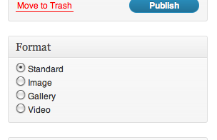
The post format you choose determines how your post will look, and each format requires a slightly different setup to work properly.
Posting articles
Normal articles should use the Standard post format.
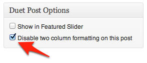
Using the two-column format
By default, Standard posts will use Duet’s two-column layout for the content. If you’d prefer to use a single-column layout for your post, you can check the option to “Disable two column formatting on this post” from the Post Options meta box (usually near the bottom right side of the Post Edit screen).
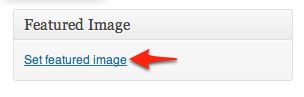
Posting images
To publish a single highlighted image, select Image as your post format. Then, set the Featured Image of your post to the image you want to highlight.
 https://thethemefoundry.com/wp-admin/edit.php?post_type=tutorial
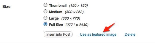
The Featured Image will be included at the top of the post and includes a link to the full-size image.
Posting galleries
To publish a gallery of images, select Gallery as your post format. Then, upload your images to your post using the WordPress media uploader. Finally, insert your gallery into the content of your post using the [gallery] shortcode.
Here is a short video explaining how to upload images and insert a gallery.
Would you like to autostart your gallery? If yes, please read through the section of this theme’s documentation about enabling gallery autostart.
Of course, you can also use the default WordPress gallery in the Standard post format.
Posting video
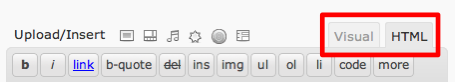
To highlight video content, select Video as your post format. Make sure you are editing in HTML mode, and paste your embed code from YouTube, Vimeo or another video hosting service directly into the post content area.
Styling your posts
Duet features a number of custom styles that can make your content stand out even more. Below are instructions for adding these custom styles to your content.
Pull quotes
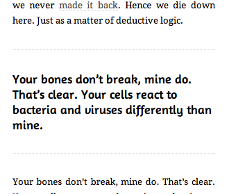
To style as a pull quote, you need to be in HTML mode and wrap your quote with a h2 heading with a class of “pullquote”, like so:
<h2 class="pullquote">Your quote goes here</h2>
Story end
To style an asterisk at the end of a story, you need to be in HTML mode and wrap your asterisk with a span with a class of “story-end”, like so:
<span class="story-end">∗</span>
Ampersand
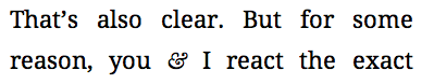
To add a special style to an ampersand, you need to be in HTML mode and wrap your ampersand with a span with a class of “amp”, like so:
<span class="amp">&</span>
Horizontal rule
Horizontal rules (hr tags) are automatically styled in Duet, and give a distinct visual break in your content
Alerts
Alerts call attention to specific sections of your content. To style an alert, you need to be in HTML mode and wrap your content with a div with a class of “alert”, like so:
<div class="alert">Your content here.</div>
There is also a special green style for “success” alerts:
<div class="alert success">Your success message here.</div>
a yellow style for “notice” alerts:
<div class="alert notice">Your notice message here.</div>
and a red style for “error” alerts:
<div class="alert error">Your error/warning message here.</div>
Classic captions
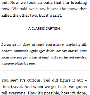
To style as a classic caption, you need to be in HTML mode and wrap your content with a div with a class of “classic-caption”, like so:
<div class="classic-caption">
    <h2>A classic caption</h2>
    Lorem ipsum dolor sit amet, consectetuer adipiscing elit.
</div>
Classic titles
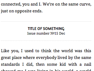
To style as a classic title, you need to be in HTML mode and wrap your content with a div with a class of “classic-title”, like so:
<div class="classic-title">
    <h2>title of something</h2>
    Issue number 15 Dec
</div>
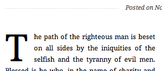
Manual drop cap
Sometimes you need to add drop cap styling somewhere besides the first paragraph. You can manually add drop cap styling by going into HTML mode and wrapping the first letter with <span class="drop-cap">, like so:
<span class="drop-cap">T</span>he first letter will be drop-cap.
Creating pages
Duet includes 6 different page templates, including two full-width templates: one with a single content column, and one with Duet’s unique two-column layout.
Simply select one of these templates from the Template drop-down on the Edit Page screen, and your content will be formatted accordingly.
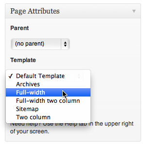
Archives and sitemap pages
The archives and sitemap pages on the demo site are also set up using page templates. Simply select “Archives” or “Sitemap” from the Template drop down (seen above) to get the special display for these page types.
Using the featured slider
To add a post to the Featured slider, please follow these steps:
- Navigate to Posts → Add New;
- Set a Featured image for your post, with dimensions greater than 880 x 390 pixels;
- Mark the Show in Featured Slider option in the Post Options meta box (usually near the bottom right side of the Post Edit screen).
- Click Publish.
For each additional image you wish to add to the Featured slider, repeat all four steps.
Configuring the slider
You can also configure some of the slider functionality through the Appearance → Theme Options page.
Under the “Logo & Featured Slider” section, you’ll see options to
- Autostart the slider on page load
- Toggle the slider animation
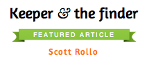
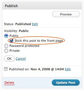
Adding a “featured” banner to a post
To add a featured banner (seen above) to a post, you need to mark the post “Sticky” under the visibility settings on the Post Edit screen:
Changing the banner text
On your Appearance → Theme Options page, under the “Post Display” section, there is an option for “Sticky post text”. Whatever you enter here will be used as the text for the featured banner (seen above).
Enable the slideshow on posts and pages
To enable a slideshow on a page or non-gallery post, add your gallery; then, paste the following shortcode into your page content, replacing the default [gallery] shortcode:
[gallery slider="true"]
Using the regular [gallery] shortcode will remove the slider styling and return to the default WordPress gallery.
Enable gallery autostart
To autostart a slideshow within a gallery post, add your gallery; then, paste the following shortcode into your post content, replacing the default [gallery] shortcode:
[gallery autostart="true"]
To autostart a slideshow within a page template or non-gallery post, include autostart="true" into the shortcode, like so:
[gallery autostart="true" slider="true"]
Customizing your theme
Change the color scheme
On your Appearance → Theme Options page, under the “Fonts & Colors” section, you’ll see a Color Scheme selector, which allows you to toggle between Duet’s 3 lovely color schemes: orange (default), green, and blue.
Typography Options
On your Appearance → Theme Options page, under the “Fonts & Colors” section, there are two options for controlling the fonts used on your site.
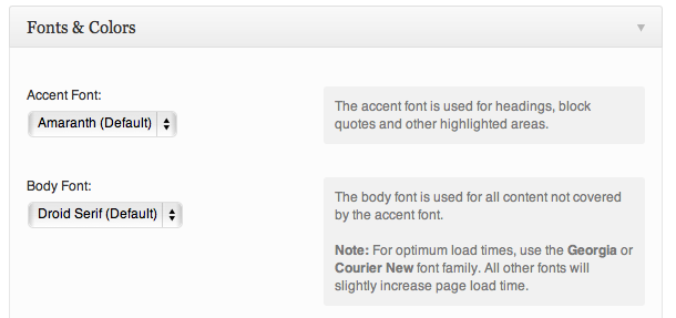
The accent font is used for headings, block quotes and other highlighted areas.
The body font is used for all content not covered by the accent font.
Remove the first letter style
By default, Duet features a unique drop cap style on all posts. To disable this, go to your Appearance → Theme Options page, and under the “Post Display” section check the “Remove drop cap on first letter” option.
Disable columns for all posts
Columns can easily be turned off for all posts in Theme Options.
- Goto Appearance → Theme Options → Layout
- For the Columns display drop down, choose “Columns off”
- Click Save changes
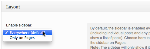
Enabling and disabling the sidebar
By default, the sidebar appears everywhere on your site. If you’d like to have the sidebar appear only on Pages you’ve created, go to the Appearance → Theme Options page. Under the “Layout” section, you’ll see an option to control the sidebar display:
To disable the sidebar completely simply remove all widgets from the sidebar the Appearance → Widgets page.
Social buttons (Twitter, Facebook, Flickr, Google+)
Your social buttons are controlled in the Appearance → Theme Options page, under the “Footer” section.
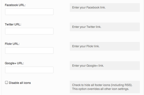
Simply fill in the URLs for each social site you want to include in your footer, and an icon will automatically be added for you. Leave any of the options blank, and no icon will appear.
Footer copyright notice
The option for your footer copyright notice is found below your sharing options, under the “Footer” section of your Theme Options page.
Using keyboard navigation
Duet features easy keyboard navigation on your featured slider and individual galleries. When on the homepage, using the left and right arrow keys will navigate the images in the featured slider (if it is active).
In addition, when on individual gallery posts, the left and right arrow keys can be used to navigate through the images in the gallery.
Image dimensions
Where a height is not provided, feel free to insert your own custom value.
Featured slider image:
- Width: 880px
- Height: 390px
Blog post image:
- Width: 880px