Twenty Twelve: First sketches
By team on April 19, 2012
At the end of last year Matt and Lance contacted me and asked if I’d be interested in designing Twenty Twelve, the default WordPress theme for this year. I was of course honored and excited, and after some discussion about expectations and details, we started the project in relative secrecy.
After a fast start, Twenty Twelve development slowed to a crawl in February (which was my fault) and in March we decided including it in WordPress 3.4 wasn’t a good idea. Since then we’ve re-focused, moved the Twenty Twelve repository to Github, and established a regular work schedule to ensure it’s ready for WordPress 3.5.
Update! Twenty Twelve has launched.
Twenty Twelve has launched and is now available in WordPress 3.5 and available for download in the WordPress repository. If Twenty Twelve is too basic for you, be sure to check out our WordPress templates or read our guide on finding the best WordPress themes.
Following on Github
If you’re following along over on Github, expect to see commits going in on Wednesday and Thursday mornings. Right now the team is small: Lance and I are working on the code and chatting with Matt and Nacin as required over Skype. We may be small, but we’re more than happy to accept bug fixes and suggestions in the form of pull requests. In fact, a few folks have already chipped in — thanks Konstantin Obenland and Jeff Sebring!
Over the next few months I’ll be posting more about the decisions and discussions we’ve made and had while building Twenty Twelve. At first, these will be a bit backdated, but the posts will slowly catch up as we move along. We’ll also put up a live demo site sometime soon, so you can see Twenty Twelve in action!
First sketches
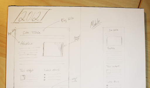
First sketches are a basic overview for the direction of the theme. It’s the first thing I do when I sit down to design a theme. They don’t set anything in stone, but they set the tone and aesthetic for the design. The goal here was to avoid anything fancy, whimsical, or tricky. The focus for the theme will be clean lines, precise spacing, and great typography. Twenty Twelve should be a joy to read.
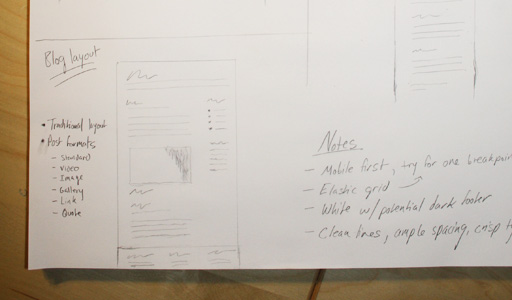
These sketches were completed back in January, and some things have changed since then, but the general look and feel of the theme has stayed the same. In the next few posts we’ll dive a little deeper and take a look at some of the decisions we’ve made so far. Stay tuned!
Enjoy this post? Read more like it in From the workshop.
