Archive of posts with the Tutorials topic
We’ve packed Make & Make Plus full of great features. The builder. The 100+ Customizer options. The eCommerce capabilities. But we’re also proud of the details. Here are ten details we think you ought to know about.:
With Make Plus, you can remove the header on any page, show or hide sidebars on your default pages and posts. Yes, you read that right. You can choose to show or hide the sidebars on a per-post basis.
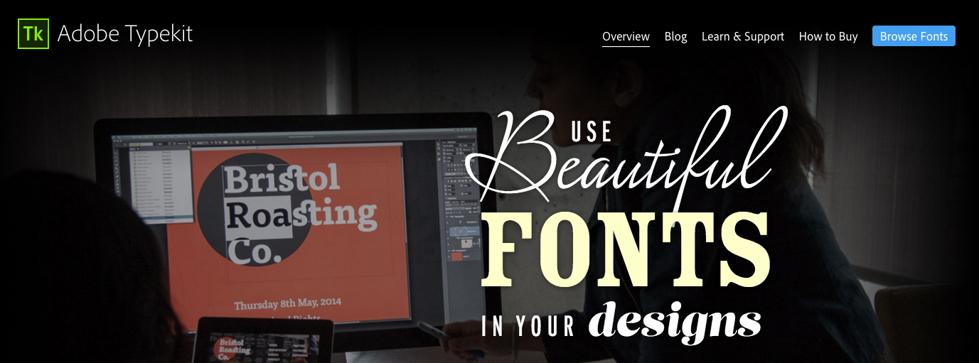
Typekit offers over 130 fonts for free, and if you’re an Adobe CC member, a Portfolio Typekit account is probably included in your subscription. With Make Plus installed, you can add a kit to your site and control the fonts through the Customizer.
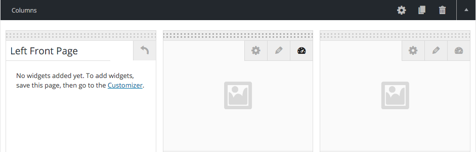
We know you want the flexibility to add widgets to your page builder pages, so we made the Columns section columns widgetizable (is that a word? It is now!). Click, name your widget section, and then add your widgets in the Customizer (or the Widgets screen). Stumped for what kinds of widgets would go on your page? Maybe a Twitter or Instagram feed? Or perhaps…
4. Post Lists widget
Make Plus includes a Post Lists widget that you can add to a widgetized Column. Why would you want to do this? To replicate a posts-page style list with sidebar on your home/front builder page, of course!
5. Remove padding from bottom of each section

With Make Plus, you can choose to remove the padding below each section in the builder. How is this useful? If you want to stack Banner sections on top of each other, or hide the site background color between elements with different backgrounds, you’ll want this handy check option (the alternative is to do it via custom CSS in your child theme).
Speaking of custom CSS, Make Plus gives you the ability to add a custom HTML ID or class to each builder section. If writing code is your fancy, you can use this to easily style up similar elements or easily add internal page links (to build a one-page site).
7. Page and section duplication
Does your site use duplicate sections throughout? Perhaps a common banner element unites your pages? With Make Plus you can easily make a copy of any builder page or section and then edit it before you republish.
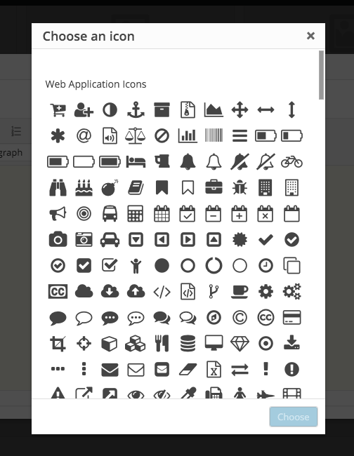
Using icons as part of your site design can help your visitors scan for and find key information on your pages. We made it easy. You can insert any of the 585 icons in Font Awesome’s collection right from the content editor. Bonus: This is actually a feature in Make, you don’t need Make Plus to get your icon on.
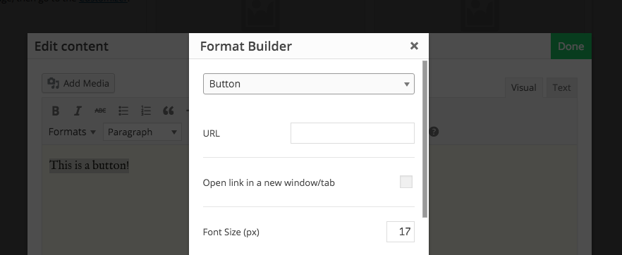
The Format Builder lets you select text in the visual editor and create stylized notice boxes, lists, and buttons. Choose the background and border color, font size, and add an icon — without adding any special coding or touching a line of CSS. Use this feature to add button-style Call To Actions on sales pages and in Banner sections — simple!
We’ve included documentation on Make’s action and filter hooks, so dev savvy Make & Make Plus users can customize and modify the theme to their heart’s content. How far can you push the limits of Make & Make Plus?
Do you have a favorite feature in Make or Make Plus? Any features you’d like to see in a new version? Let us know on twitter with the hashtag #iusemake.

Do you remember, before WordPress, how long it used to take to put a website together? To code out, from scratch, each page, hardcode each link and image, duplicating your menus and footers across your site (and then editing each page if you needed to update one thing!). Through the #iusemake series on the blog, we’ve seen how people are launching faster and more efficiently than ever. We’ve heard everything from 24 hours to 30 days to put a site together, which is astounding really, when you consider what kind of impact a professionally built web presence can have on a business.
If you need to launch tomorrow, we’ve prepared a helpful checklist of items to go over before you send that announcement email or tweet.
Launch checklist
1. Edit copy
It should go without saying that misspellings and typos are going to impact the professional veneer of your website. But not only should you edit for small mistakes, now’s a good time to take a fine tooth to your website copy for style consistency.
Look for:
- Headers that have the same format (first letter capitalization, etc.)
- Consistent use of text header tags (H1, H2, H3, etc.)
- Brand and industry specific word consistency
After you’ve finished with your site copy, now’s a great time to recheck your social media also — just to make sure your profiles match the new site.
2. Check for broken links (and also on social media icons)
Click every link. Yes. Every link. Even click links you’re certain work. That one dead link could mean the difference between a purchase and a bounce, so take the time to tidy up your menus, site copy, and social icons.
3. Make sure images/banners look good on all devices
In case you haven’t looked at your site on a mobile device before, make sure you get in one good round of testing before you launch. Your images might not be cropping and scaling how you imagined they would, and your content might not be breaking across the screen sizes in a way that makes the most sense to your visitors — and better to fix those tiny details before you go live.
Tip: Start with your mobile design when you begin putting together your site. If it looks good on mobile, tweak it for larger screens, instead of vice versa. Learn more about optimizing images for WordPress.
4. Double check your contact form and optin form
Join your own mailing list to see what the confirmation emails look like. Make sure your optin gifts are downloading correctly. Send yourself a test message from each and every form on your site, using different email addresses to test your spam filters.
And finally, if you moved your site from a development site to the live site, David Sutoyo, a Make Plus Developer in our Slack channel mentioned, “One point that I’ve learned to always check: make sure the live site isn’t blocking search engines, since sometimes the staging environment might be set to block them.”
What do you check for when you launch a site? Let us know in the comments or on Twitter. I’ll be collecting your ideas in a tutorial for our Make docs.
It’s finally starting to feel like spring (in the Western Hemisphere anyway) — which always inspires me into a sort of tidying frenzy. It’s also a great time to take a moment and refreshen your website, especially if you’ve been in hibernation mode all winter.
This week, we’re dusting off the links.
Week 1: Find and fix broken links
Time to complete: 10 minutes to 2 hours
Nothing frustrates a site visitor more than clicking on a link and being met with a 404 page. Unless it’s a clever 404 page. I digress. Finding and fixing broken links can be a pain, but it should be a priority if you’re maintaining a professional business web presence. It’s not always obvious though, especially when you’ve got a blog full of outbound links, which sites might have shut down or reorganized. Taking a few minutes to find and fix those broken links can go a long way to ensuring your credibility as a resource.
There are a few ways to tackle this chore, but the easiest is probably to use this handy free plugin: Broken Link Checker.
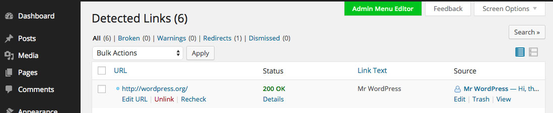
Once installed and activated, you can find Broken Link Checker in the Tools section of the Dashboard. The plugin will scan, find and notify you of broken links on your WordPress site, either through the WordPress dashboard, or with automated emails.
Depending on the size and scope of your site, the scan can take from just a few minutes to a few hours. If you have to wait, I recommend you seize the opportunity to dust and detangle your computer chords.
Once the plugin has detected broken links on your site, you can update them right from the plugin admin screen, which saves the time of having to manually edit each post individually.
Caveat emptor: the plugin can be a resource drag, so you might consider deactivating (and then deleting it if you don’t plan to keep it updated) after use.
If you’d rather not install another plugin, another dead-simple way to find those broken links is with W3C Link Checker.
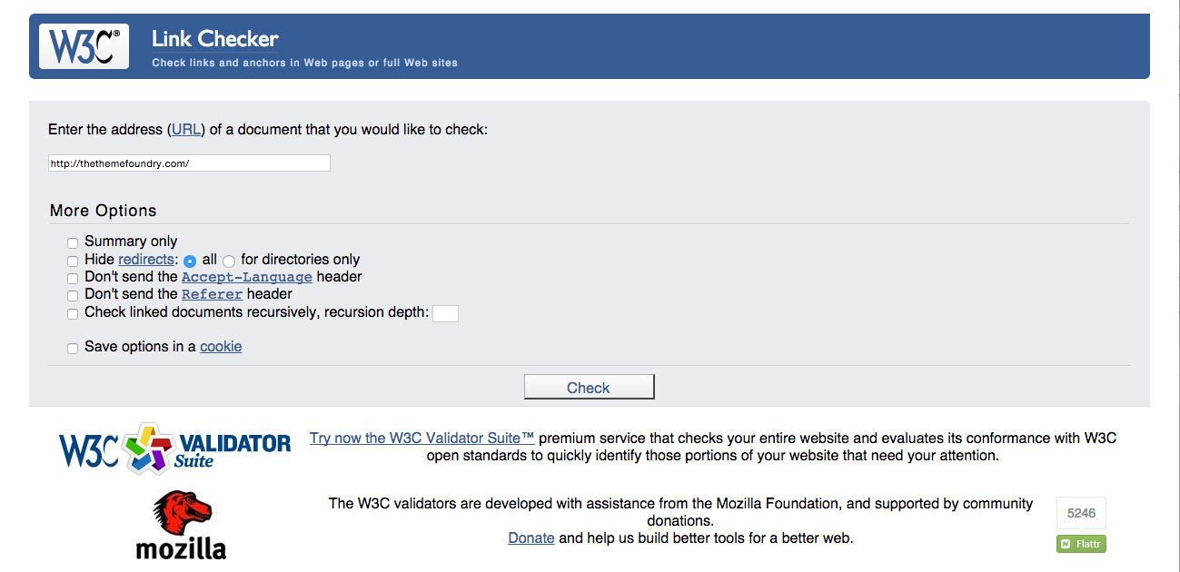
It scans your website and outputs a list of links you should check on. I noticed that it doesn’t like shortlinks (generated by Twitter, etc.), so you’ll have to check those manually. You’ll also have to go back into your posts and pages to edit the links if you find any errors, which makes the whole process significantly more tedious.
Finding and fixing broken links isn’t the most glamorous website chore, but if you check in on it regularly — quarterly even — you won’t have to worry about your visitors hitting a brick wall while browsing your site.
Consider this a friendly reminder! When was the last time you checked your site for broken links?
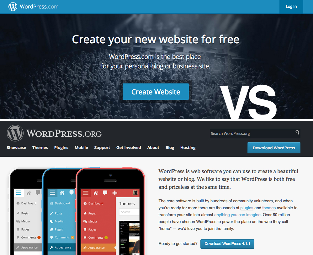
We love WordPress.com and have a lot of happy Theme Foundry users over there. It’s a great managed solution for people who are new to WordPress or just getting started with a blog or website. But occasionally we are asked about transferring from a site hosted on WordPress.com to a self-hosted installation of WordPress.org. Today we’re going to look what you can expect if you decide to move your site from WordPress.com to a self-hosted WordPress.org site (and vice versa).
Read more
If you’re selling online, chances are you’re at least familiar with the concept of the landing page. You might have even tried to put one together for a product, event, or class you’re offering. Typically landing pages are structured differently than a traditional website, though. They have a singular purpose, and often lack standard WordPress theme elements like a header, menu, sidebar and footer. This kind of page design is easy to accomplish with Make, and in today’s post, I’m going to show you how.
Landing pages are designed to tell a story. And in particular, they’re designed to tell the story of your product. Here are three basic principles you should keep in mind when creating landing pages.
Read more
Using images in your content helps you express ideas, attitudes, and sentiments, all the while improving communication between your brand and your audience. But images can only help you do these things when you choose the right ones.
When you choose poor or low quality images, your audience might find them ambiguous, bland, or, even worse, inauthentic. And you don’t want that.
Let’s explore how to identify images that support your message and elicit a positive response from your audience. We’ll focus on images from popular stock repositories that are affordable for most small businesses.
Read more
Web typography baffles many business owners and WordPress developers. What fonts and font layouts are most appropriate in a WordPress theme – and how should you evaluate the plethora of options at your disposal?
While there isn’t a catch-all solution to the typography question, one thing is certain: typography should help your readers to obtain value from your written content – not discourage them. To identify typography meeting that specification, pay close attention to the following:
- Readability: Reading your content should never be a struggle. It should be effortless and natural.
- Appearance: Typography should have a clearly defined hierarchy, contrast, and spacing among content areas.
- Errors: Some themes omit, overuse, or combine certain typographic styles. You should avoid themes that do this.
Think of these issues as a checklist where each item informs the quality of a theme’s typography. When you’re evaluating WordPress themes, typography should always meet these benchmarks! Let’s examine each issue in greater depth so you can identify WordPress theme typography that works for your website.
Read more
All themes from The Theme Foundry come translation-ready. Instead of making you create a file containing the human-readable text from a particular theme, we’ve included that file with the theme itself. All that’s left is performing the actual translation, which is where you (or a professional translator) come(s) in.
Why translate a WordPress theme? For starters, around 44% of WordPress websites are written in a language other than English. People all around the world use WordPress!
Translating a theme can also help you “localize” it for a specific lexicon. For example, our friends in the UK might “get ‘round to” a task while Americans simply “get to” it. Localization can help you tailor a theme to the vernacular of a specific country or region, if you so desire.
Tip: Use a virtual private network to research common terms that appear on search engine results pages in other countries.
We’re about to show you how to translate our themes. But first, let’s examine the three types of files involved in the translation process: .pot, .po, and .mo.
Read more
About, About Me, About Us, Who We Are, Our Story, Meet the Team… the humble About page comes in many different flavors. Despite being stylistically different, all serve the same fundamental purpose of telling your audience about you – in other words, showing them what you’re about.
So, does your website need an About page? We think most bloggers, special interest organizations, and small to midsize businesses using WordPress should publish an About page in some shape or form; the reasons are twofold:
- Authenticity and trust: There’s a reason why About pages are among the most visited pages on many websites. Your audience wants to confirm that you’re genuine and, if you’re selling something, that you’re someone with whom they want to do business.
- Brand awareness: What better way to call attention to brand attributes than with a page that celebrates them? The About page is your opportunity to showcase your (or your organization’s) identity.
Let’s run through a few crucial steps that will help you create an About page that’s useful to to your audience and bolsters your brand. Not every About page is the same because no two publishers have the same goals. To know what kind of content should appear on your About page, you have to know what you’re trying to achieve. Which brings us to Step One…
Read more
If you’re staring at a white screen wondering where your WordPress website went, you’re not alone. Nearly every avid WordPress user has experienced the fabled “white screen of death” at one time or another. It’s a pain when it happens, but it’s usually easy to fix.
We’re about to explore several common causes of the white screen of death – from plugins to PHP and beyond. If you need to get rid of a white screen and recover your website right now, you’ll learn how. And if you’ve tangled with the white screen of death previously, don’t click away yet! We’re going to discuss various white screen scenarios, some of which you may not have encountered.
Read more