Three elements of a great landing page (and creating one with Make)
By on January 29, 2015
If you’re selling online, chances are you’re at least familiar with the concept of the landing page. You might have even tried to put one together for a product, event, or class you’re offering. Typically landing pages are structured differently than a traditional website, though. They have a singular purpose, and often lack standard WordPress theme elements like a header, menu, sidebar and footer. This kind of page design is easy to accomplish with Make, and in today’s post, I’m going to show you how.
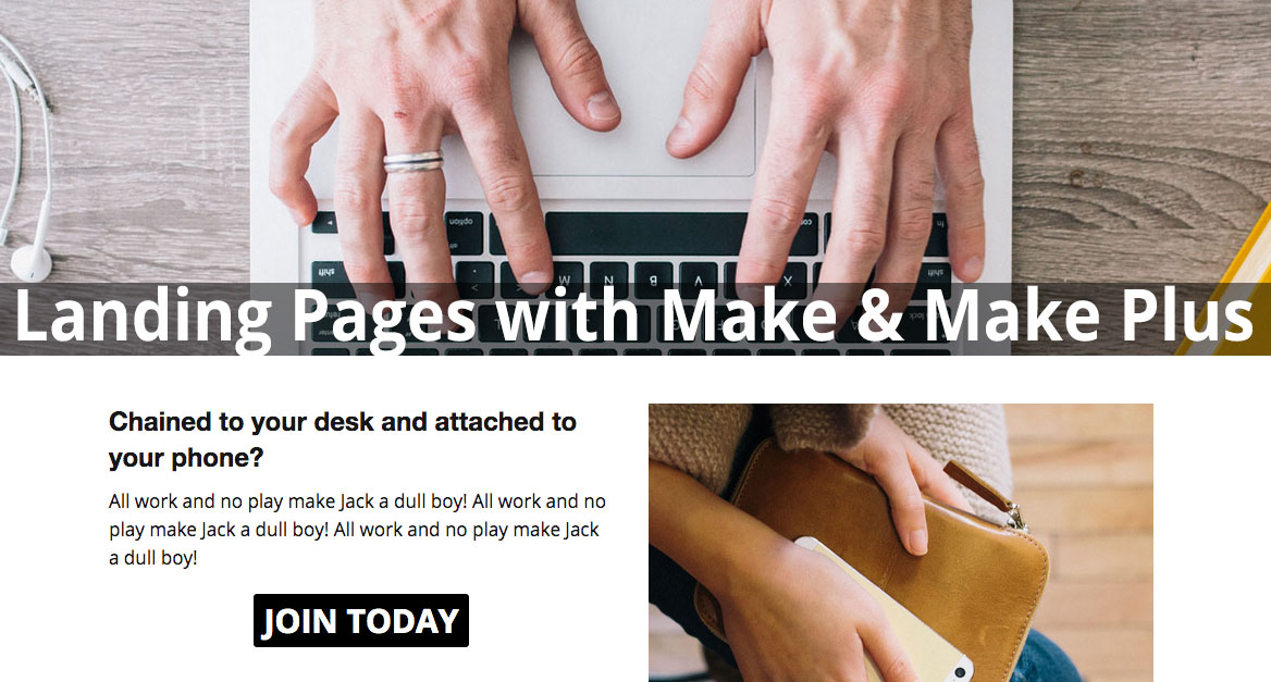
Landing pages are designed to tell a story. And in particular, they’re designed to tell the story of your product. Here are three basic principles you should keep in mind when creating landing pages.
1. Strive to deliver maximum impact with economy and efficiency
Leverage the banner section of Make to create full-width galleries and banners. With the Columns section of the Page Builder, you can organize your content in columns and rows for maximum readability, and bookend your main points between strong visuals that make and leave a lasting impression.

Make Plus includes a Landing Page among the available Quick Start templates, complete with recommended image sizes. Once you’ve made it your own, go over all your content, copy and images again, and eliminate everything that doesn’t further your purpose or guide your visitor to the desired outcome.
2. Make sure you’ve set a clear course and strong call to action
The last thing you want is your visitors to be confused about the next action to take. Use visual cues and clear language to convert visitors to leads, or leads to sales. It’s a good idea to repeat your call to action again if your page scrolls past the fold.
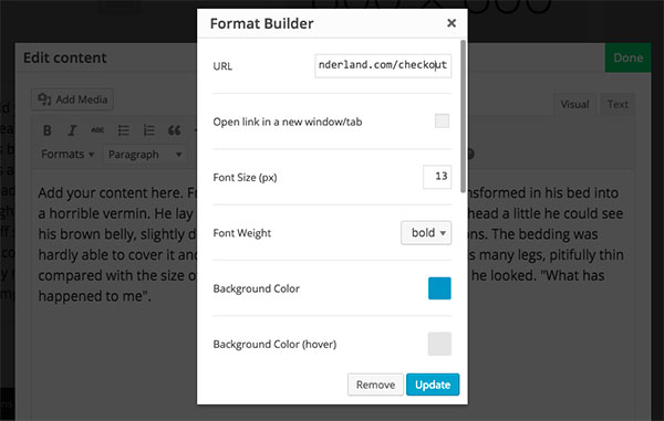
Make makes it easy to create call-outs and buttons with the Format Builder in the page content editor. These visual clues draw the focus of your visitor, so make sure you spell out exactly what you’re hoping they’ll do — optin, buy now, sign up, watch this.
3. Create a distraction-free environment for your audience to consider your offer
Marketers recommend landing pages to keep your audience captivated and direct them to a singular purpose (usually to purchase or opt-in). To that end, it’s ideal to minimize off-site links and distraction. You don’t want to direct visitors to an opt-in page only to have them get distracted by your sidebar and click away.
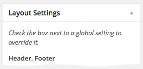 With Make Plus, you have per-page control over whether your site headers and footers are displayed. This means your main site can still have all beautiful functionality of a header and navigation menu, sidebars and widgets, but you can also create separate but stylistically consistent landing pages without those unnecessary clickable temptations.
To override your global settings and hide both site headers and footers, find the Layout Settings meta box to the right of the page editor and make sure both boxes are checked.
And finally, as a bonus tip, be flexible, experiment with format, design and copy. Great marketing is part psychology, part research, and part intuition. Find out what kind of images and language inspires and motivates your target demographic, and integrate that into your messaging.
Have you ever created a landing page before? Did it work? Do you have any insights or advice on the process? We’d love to know!
Enjoy this post? Read more like it in Tutorials.
