Create compelling About page content with these tips
By team on October 2, 2014
About, About Me, About Us, Who We Are, Our Story, Meet the Team… the humble About page comes in many different flavors. Despite being stylistically different, all serve the same fundamental purpose of telling your audience about you – in other words, showing them what you’re about.
So, does your website need an About page? We think most bloggers, special interest organizations, and small to midsize businesses using WordPress should publish an About page in some shape or form; the reasons are twofold:
- Authenticity and trust: There’s a reason why About pages are among the most visited pages on many websites. Your audience wants to confirm that you’re genuine and, if you’re selling something, that you’re someone with whom they want to do business.
- Brand awareness: What better way to call attention to brand attributes than with a page that celebrates them? The About page is your opportunity to showcase your (or your organization’s) identity.
Let’s run through a few crucial steps that will help you create an About page that’s useful to to your audience and bolsters your brand. Not every About page is the same because no two publishers have the same goals. To know what kind of content should appear on your About page, you have to know what you’re trying to achieve. Which brings us to Step One…
1. Identify your objectives.
What do you need to communicate to your audience? Every brand has different objectives, and your About page should align with yours.
To identify your objectives, take a step back. Ask what you’re trying to achieve with your website. Then decide how your About page content can bring you closer to those achievements. To the extent possible, you should incorporate all of the following as you tease out your objectives:
- Audience insights: About page content should answer the real questions people are asking about you. You can gather audience insights informally through interactions on or offline or formally through analytics and research.
- Your story: A compelling story fosters affinity for your brand and helps your audience identify with you. You surmounted serious obstacles to get where you are now – tell us about them! Every brand has a story, even if it takes some work to assemble all of the chapters. Hint: If you or the people who built your organization factor heavily into your story, you should probably include at least one image of yourself or your team.
- Business goals: If your website has a tangible goal (e.g. produce revenue), the About page can bring you closer to it. Service providers, for instance, might invite readers to contact them somewhere in the About page copy. For others, using the About page to showcase their brand attributes will be sufficient for furthering business goals.
For an example of an About page that demonstrates a clear understanding of the publisher’s objectives, look no further than Chris Lema. Chris, who happens to love our Make theme for WordPress, serves up an About page that’s very light on copy.
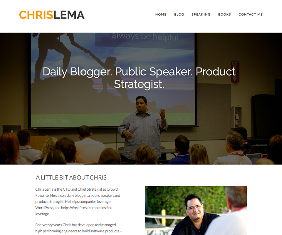
It’s ok that Chris’s About page doesn’t have much text. The full-width image tells his audience everything they need to know: Chris is a leader in his field (WordPress) and other people listen to what he has to say.
In addition to a compelling origin story that establishes his experience and expertise, the page also contains calls to action for his consulting and speaking services. Chris clearly understands his objectives as they relate to his audience and his business.
Keep Chris’s About page in mind as you determine what needs to appear on yours. How can you merge audience needs and business goals, all the while capturing the essence of your brand?
2. Create clear, brand-befitting copy.
Some About page tutorials stress the so-called “5 Ws:” Who, What, Where, When, and Why. They say every About page should seek to address these questions. Every time. No exceptions.
While we won’t deny that it can be useful to answer these questions as they relate to your business, blog, or project, we also don’t think About page copy needs to follow any hard and fast rules all the time.
Your About page is all about you! The copy doesn’t have to address the same exact issues covered in someone else’s About page; however, it should align with the items we went over in the section above – audience, brand, business goals – in an effort to further your objectives. It should also use a voice that’s in keeping with your brand.
Finding that voice requires an understanding of your audience. Who are they? What kind of language will elicit a positive response from them? The copy on your About page should use language that fits your brand and your readers’ sensibilities.
One good way to find your voice is to create a “this, but not that” list of brand traits. Consider MailChimp, a company noted for its memorable brand and dedication to content. The company’s style guide includes the following section:
MailChimp’s unofficial tagline is “Love what you do,” and that spirit should come through in every piece of content we produce.
MailChimp is:
Fun but not childish
Clever but not silly
Confident but not cocky
Smart but not stodgy
Cool but not alienating
Informal but not sloppy
Helpful but not overbearing
Expert but not bossy
Weird but not inappropriate
Depending on your audience, your About page might use no-nonsense, professional prose or playful, informal language. By performing a “this, but not that” exercise, you can refine those characteristics and determine how the About page copy should “feel” to readers.
If you’re finding it hard to identify brand traits and align them with the language on your About page, we suggest that you:
- Avoid being overly casual: It might be good for people to know you’re fun, but is looking fun a legitimate brand objective? If you’re not sure, you should probably hold off.
- Be clear and concise: More isn’t always better. With or without a clearly defined brand voice, you should focus on the issues we looked at in Section One above. Then step aside.
When applicable, also consider an international audience. If you receive traffic from abroad, be aware of how local expressions might seem to people from other parts of the world.
For example, WordPress greets most of us with the very American salutation, “howdy.” I’m from Australia, where nobody says “howdy.” I recognize that WordPress is just trying to sound friendly, but it always strikes me as very foreign and quaint.
3. Present your content logically.
With your objectives defined and brand-befitting, audience-appropriate copy ready for action, you should also be sure your About page makes it easy for readers to consume your content. Many small publishers will have simple, straightforward About pages with little more than a few paragraphs of copy and an image – and that’s just fine!
Your About page can be short and still be effective. However, organizations with more nuanced objectives will want to focus additional attention on the organization and layout of About page content. If your About page requires more than one section or visual element, you should be very deliberate about how those are displayed.
We recently examined the South Milwaukee Performing Arts Center’s (SMPAC’s) website, pointing out some of the interesting things they’re doing with our Make theme. One item we didn’t discuss was their About section – not About page, but About section – which consists of multiple pages, all of which help the organization meet its objectives for public communications.
In an effort to showcase various layers of the organization, SMPAC published separate pages under an About menu item: Mission, People, and Education. There’s also a page in the About section that contains archives for SMPAC’s newsletter, SMArt.
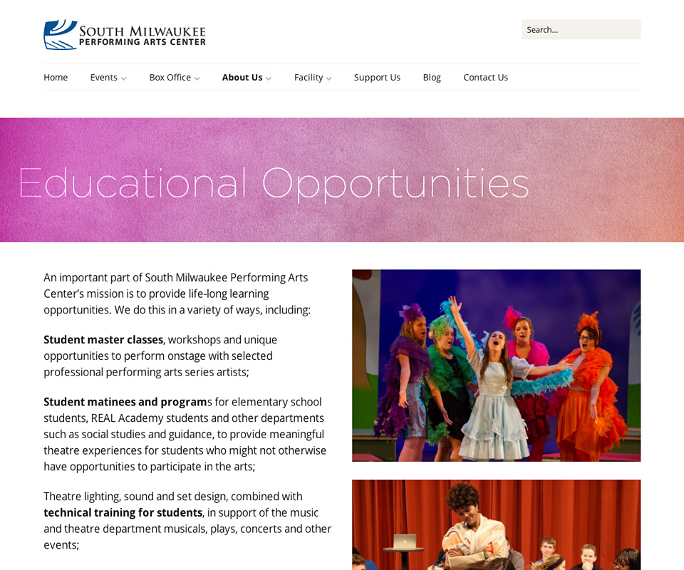
SMPAC understands what drives its success: a combination of great ideas, talented people, and programs that empower the local community. These are the things SMPAC’s all about, yet fitting them all on one page might have been overkill.
So SMPAC divided them up. The resulting presentation is simple and logical. It’s easy for visitors to find the information they need, and the copy aligns with SMPAC’s brand.
Next steps: your About page
If it’s been awhile since you revised your About page, go look at it now. Ask whether it’s helping you do all of the following:
- Satisfy objectives: These relate to your audience, your brand, and, potentially, your business goals. Always know what you’re trying to achieve.
- Highlight brand traits: Here’s where copy makes a huge difference. If you’ve never thought about brand traits, determine what they are and align About page language with what you come up with.
- Deliver content seamlessly: More complex About pages will require serious attention to layout. If your About page is long and complicated, try to make it concise and simple, even if that means breaking it up into multiple pages or sections.
Remember: your About page shouldn’t be an afterthought. It could be your biggest opportunity to make your audience fall in love with your brand. Be particular about your About page – spend time on it. Readers will notice.
Enjoy this post? Read more like it in Tutorials.
