Building blocks of responsive website design
By team on July 10, 2014

By now, few can deny the benefits of responsive website design. The web follows us everywhere, and responsive websites help publishers connect with readers on a variety of devices.
But what constitutes quality responsive design? Adapting content width to screen size is one thing, but providing a seamless, consistent experience across platforms is quite another. With an eye toward how we design responsive WordPress themes at The Theme Foundry, let’s examine some primary building blocks of effective responsive websites.
Readability
Websites should be easy to read. To maintain website readability across platforms, mobile responsive design demands special attention to elements that affect the reading experience; some of those include:
- Font size: Text should be large enough to read without zooming, squinting, or rotating the device.
- Font weight: In cases where thin characters work nicely for small screens, “thickening” them may actually improve readability for desktop users.
- Line height: The space between lines of text on a mobile device screen doesn’t always yield comparably readable text for desktop users.
To understand why responsive design takes these factors into account, imagine you have an image on your screen. You want to pick out details from part of the image, so you enlarge it to get a better view. The problem, however, is the more you enlarge the image, the more pixelated and unclear it becomes. No matter how hard you try, you can’t strike a balance between sharpness and visibility of detail.
Mobile responsive websites that ignore readability enhancements create a similar problem. It doesn’t matter how much you zoom in or rotate your screen – the text never looks quite right. And when text doesn’t look right, the reading experience suffers.
Focus
At the Theme Foundry, we design with a mobile-first approach. Since smaller screens generally provide fewer opportunities for visual excess, designing for mobile at the outset helps us eliminate clutter from our themes.
And less clutter makes it easier for readers to focus on your content.
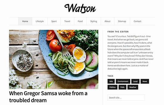
Consider the layout options in our Make theme. The page builder tool lets you add products or images in a grid pattern, rearrangeable content columns, and other design elements to your pages.
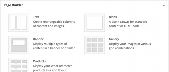
All of these elements display beautifully on mobile and desktop devices – and that’s by design! On mobile devices, for instance, the image gallery’s grid layout renders as a single column displaying images per the order specified in WordPress. There’s no need for readers to zoom in or engage in superfluous scrolling to see your images. Ease of focus, therefore, remains consistent among all devices.
Scale
Though it ties in with readability and focus, scale is a topic worth considering on its own. Appropriate scale should apply to typography and images alike; otherwise, publishers risk delivering oversized, lumbering headings to mobile devices or tiny, ambiguous vectors to desktops.
For an example of cross-platform scaling in action, look no further than this very blog post. Following the post content, you will find a button inviting you to opt-in to email updates. Let’s analyze the way scale affects this button – and the text above it – on different screen sizes.
If you’re reading this post on a desktop computer, grab your mobile device and pull up the content there as well. Same goes for mobile readers with immediate access to a desktop machine. As soon as you’ve pulled up the content on both devices, take note of the following:
- the size of the “Email me new posts” button on each screen
- the size of the body text on each screen relative to the button
As you can see, the button and preceding text are larger on desktop screens. What’s more, the text-to-image size ratio is more pronounced on mobile.
The different scales make the copy easier to read, the button easier to click, and the content easier to interact with on all devices. By contrast, a desktop-sized button might dwarf the preceding text on small screens. It would look like we were shouting at you to subscribe to our blog.
Patterns
Instead of cramming every desktop design element into your mobile screen as-is, quality responsive design must render the same features in different, yet intuitive, ways across devices. To achieve this, many designers utilize common patterns that readers will recognize.
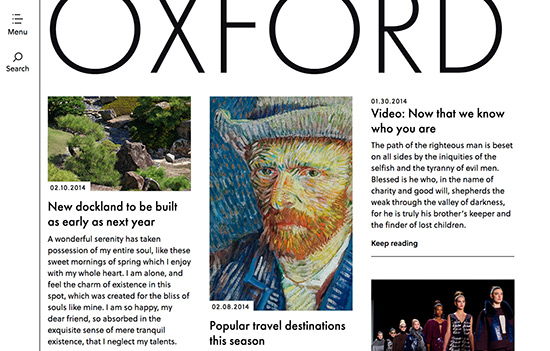
One such pattern is the three-line or “hamburger” menu icon. Our Oxford theme uses this pattern to help readers access a site’s primary navigation. Since readers only need to interact with the navigation links momentarily – and since the links would otherwise occupy lots of space on a small screen – hiding navigation by default improves readability and focus. The three-line icon alerts readers that navigation links are available when they’re ready for them.
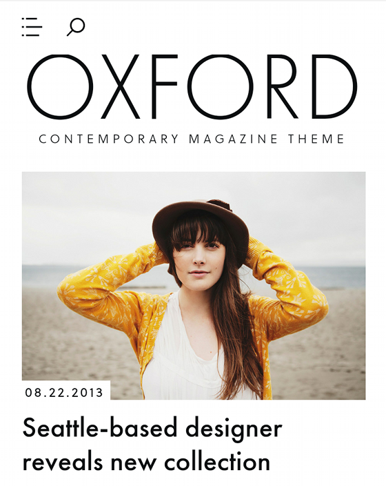
For mobile users, Oxford also displays a magnifying glass icon rather than a large, imposing search box. The icon is a recognizable indicator for search, so readers know to tap the icon when they’re ready for a search box to appear on screen.
Further reading
The issues discussed here are critical to mobile responsive design, but we’ve really just scratched the surface. If you would like to learn more about the thinking behind responsive websites, check out the following:
- Design Shack’s overview of the advantages and drawbacks of mobile-first design: Learn why designers avoid the “graceful degradation” of desktop sites for mobile in favor of the “progressive enhancement” of mobile sites for desktop screens.
- Typecast’s analysis of scale in web typography: Proportion matters in typography, and this post explains how responsive design should address problems with text proportions.
- Smashing Magazine’s “navicons” discussion: As we’ve seen, patterns in responsive design can appear in the form of icons. Here, Smashing Magazine looks at how icons help us communicate on and off the web.
To be sure, not all responsive sites are created equal. Enabling seamless experiences across devices requires significant attention to detail – not to mention a whole lot of testing. But when it’s done right, responsive design is the best way for most publishers, large and small, to make their content available to everyone who might benefit from it.
Photo credit: Holger Zscheyge
Enjoy this post? Read more like it in From the workshop.