Tim Mooney & Tranquil Space: #iusemake
By on April 1, 2015
Hey @thethemefoundry… check it out: http://t.co/BB2Lci875M How'd I do that? #iusemake
— Tim Mooney (@timmooney) March 18, 2015
Tim put together an elegant website for Tranquil Space that looks great, functions beautifully, and manages to organize a lot of information for their yoga studio students. From their website:
Our emphasis is on encouraging the growth of one’s potential, enjoying the sacred in every day, and living our five studio values: initiative, passion, community, creativity, and compassion.
Here’s how Tim uses Make to support this effort:
Tell us a little bit about your business?
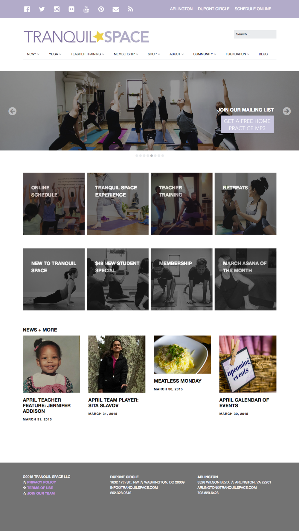
Tranquil Space is a yoga studio in Washington, DC and Arlington, VA. It’s best known for focusing on yoga as a lifestyle, taking the lessons one learns in class off the mat and into your daily life.
Why did you pick Make & Make Plus for the website? Were you looking for specific features?
As a part of the studio’s 15th year in business, we revamped the logo and website to be more in line with what the studio is now. I needed an easy-to-use theme that allowed me to create a more visually interesting and informative front page with a cleaner look, flexibility with colors, and (most importantly) a responsive design. Make got me 95% of the way there and Make Plus gave me a few extra tools to complete the task.
How long did it take you to put together? What was the process like?
Oh the process… We worked with a designer for nearly a year and the results were not what we wanted. In a fit of desperation, I discovered Make and thought it might allow me to create a demo that was closer to what we really wanted. In 4 hours, Make Plus helped me design a site that a professional designer couldn’t make happen in a year! I’ve been working in WordPress for a while now and found I usually could create decent looking designs, but often had to make visual compromises because of theme limitations. In contrast, Make Plus gave me the flexibility to create exactly the look I wanted without relying on custom CSS (something that’s closer to gibberish than not for me).
Has Make & Make Plus made an impact on the web presence/business/brand?
Make Plus gave me the tools to build a new Tranquil Space site that perfectly tells the world who we are. We’ve been getting a lot of kudos from our students and staff, particularly how the new site works on mobile devices. Because our new front page slider conveys information to our studio community in a much more effective way than before, I’ve been finding our operations are more efficient. That was a bonus I didn’t expect.
How can we follow you? Facebook, Twitter, LinkedIn, etc.?
I’m @timmooney on Twitter and I’m looking forward to my next project with Make Plus: a redesign of my bicycle touring site and podcast, Pedalshift.
You can learn more about Tranquil Space at tranquilspace.com and @tranquilspace on Twitter, Instagram and Facebook.
Do you use Make? Let us know on Twitter (hashtag: #iusemake). We’d love the opportunity to feature your good work here on our blog as well as the Make site (which is undergoing a refresh). Stay tuned for more good things to come!
