Our latest website design refresh
By team on August 12, 2014
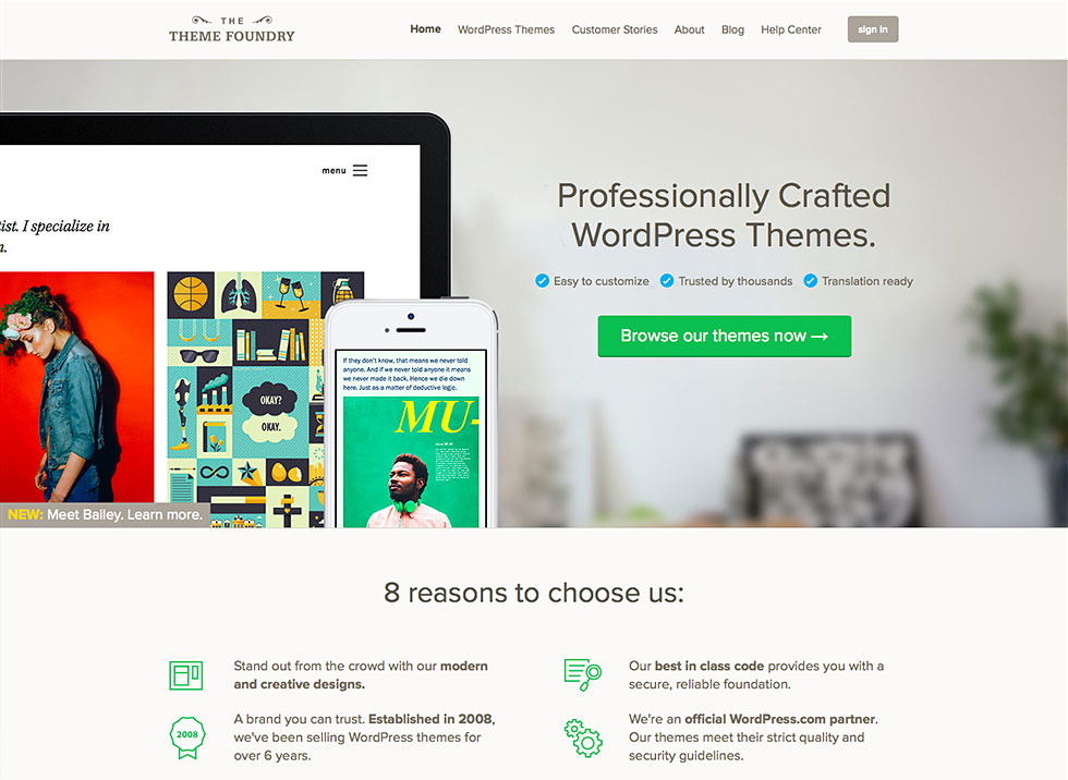
At the Theme Foundry, we strive to provide an effortless, enjoyable experience to everyone who visits our website. It’s with this objective in mind that we recently completed – and launched – our latest website refresh. Check out the home page if you haven’t seen it yet!
While the home page was the focus of this design update, every page on our website underwent several modest adjustments.
Retiring the old design
The previous home page was starting to show its age and wasn’t demonstrating our commitment to designing contemporary, refined WordPress themes.
As we worked to create the new design, we asked questions like:
- How can we communicate our message more completely and with greater clarity?
- What design adjustments will emphasize the benefits of using our themes?
- How can we make it easier for people to find the themes they love?
We think the resulting refresh addresses all of those challenges. That’s why last Friday, August 8th, we bid farewell to our longtime home page design in favor of the one you see today.
What we changed
In addition to showcasing our latest theme on the home page, we also:
- Increased sharpness and contrast to make the design pop.
- Aligned design elements with revised copy to help people find the perfect theme.
- Made it easier to know what you’re getting before making a purchase.
- Highlighted The Theme Foundry’s unique strengths in the WordPress marketplace.
- Tidied up the main navigation and removed nonessential copy.
The result? A design that clearly demonstrates why The Theme Foundry is different and helps people explore our theme collection with greater ease than before. We hope you enjoy it!
