Why a responsive theme is so important to your web strategy
By on February 12, 2015

When you’re searching for a WordPress theme, you’re probably not doing so on your mobile device. And when you’re sketching up ideas for a new website for your business, project or startup, it’s unlikely that the vision you’re conjuring is the stacked content and mobile menu toggle that ends up displaying on your iPhone.
We’ve talked about finding and evaluating responsive themes on the blog before, but we haven’t really touched on why it’s critical, especially now, for your website to be accessible to mobile users.
Maybe a few numbers would provide the much-needed clarification.
Chances are, a significant portion of your site traffic is coming from two main sources: social media and search. We spend a lot of time and energy optimizing our sites for better search results and to make it easy and effortless to share content across all the different and ever emerging social channels.
If Facebook is regularly cropping up as a site referral in your statistics, consider this: nearly 80% of all Facebook users are accessing it exclusively through mobile, and a quarter of all search is happening via mobile device. With devices connected to the internet outnumbering people on Earth, these percentages are only likely to increase.

Local businesses establishing a web presence are wise to consider their mobile strategy carefully. A survey of 5000 US adults found that 78% of local mobile searches ended with an offline purchase. And that much-coveted 18-34 demographic? 50% of them are searching on their smartphones before they buy anything. If your content doesn’t render on their small screens, they will be spending their money with your competitors.
Responsive themes are built to adapt to the screen size they’re rendered on. They respond to different screen sizes and orientations through CSS media queries and designs based on a flexible grid that can collapse and stack content in a way that preserves it’s readability and flow (to varying degrees of success).
In our Help Center, we occasionally have a customer request information about disabling the responsive nature of their themes. This might be for a variety of reasons, but usually it comes down to the fact that the responsive theme on a mobile screen rarely caputres the look and feel of the website they just painstakingly assembled. While we do our best to help out with every support request, this might not be an ideal long-term strategy for site owners during this global mobile renaissance.

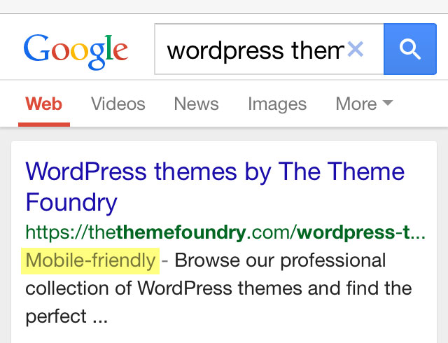
Google is gently encouraging site owners to optimize for mobile by applying mobile-friendly labels to responsive sites in search results. And in their Mobile Playbook, they recommend a mobile-first approach to design, rather than serving up a stripped down version of a desktop site for small screens.

Site owners can take advantage of their Mobile-Friendly Test to check their designs against Google’s best practices for mobile search optimization. They even provide a SEO guide geared toward mobile search and tips and strategies specifically for WordPress-powered sites.
Ultimately, your mobile strategy should be based on your website goals. For some cases, a responsive or mobile site may not be necessary or desired, but in most cases, failing to provide a complete mobile version of your website will eventually result in less traffic and fewer leads.
Enjoy this post? Read more like it in From the workshop.


