

Evaluating responsive WordPress themes
By team on July 29, 2014
Many bloggers rely on responsive design. A responsive website can help you seamlessly deliver content to a variety of devices and accommodate all of your readers.
The thing is, choosing the right responsive theme isn’t as simple as identifying a design labeled “responsive,” uploading it to WordPress, and clicking “activate.” Evaluating responsive WordPress themes actually requires careful testing, quality analysis, and diligent attention to how a design treats your content.
Testing responsiveness
Responsive themes get their name from their ability to “respond” to screen sizes. The site displays one way on desktop screens and, upon detecting a smaller screen, dynamically changes to suit it. To confirm that a theme responds to screen size:
- View a theme demo on your desktop device. Because desktop interfaces allow you to manually change the size of your browser window, they can help you test a theme’s responsiveness.
- Slowly reduce the size of your browser window. As the browser window gets smaller, you should see the theme change (i.e. respond) in kind.
- Confirm responsiveness on your mobile device. Access the same demo on your mobile device. It should resemble the design you saw on your desktop screen after you reduced the size of your browser window.
Perform this simple test for every theme you’re considering, even when the creator claims the theme is responsive, “mobile ready,” or otherwise optimized for touchscreens. Only by watching the design change before your eyes can you confirm, definitively, that a theme is responsive and doesn’t rely on some other mechanism to accommodate small screens.
Assessing quality
Being responsive doesn’t always mean a theme will render perfectly on mobile devices. There’s a wide gulf between themes that simply respond to screen size and those that go the extra mile – modifying typography, images, and other design elements to make the mobile experience just as delightful as the desktop experience.
Consider a common desktop layout for WordPress blogs: a left-aligned content area with a sidebar to the right. In a responsive WordPress theme, where does the sidebar content go when a reader navigates to your site from her iPhone?
Many themes move it below the main content area. Others, though this is less common, place it in a sliding panel that the reader can tap to access. If you publish sidebar content on your site, one of these solutions may prove better than the other. It all depends on what content the sidebar contains (navigational links? promotional content?) and how you want to highlight that content for readers.
But evaluating responsive themes based on how they render sidebar content is just one concern among many. You should also consider factors like:
- Readability: Do font size differences between body and header content scale proportionally on mobile device screens? If a theme merely responds to screen size, it may not render typography appropriately for cross-platform readability.
- Patterns: Recognizable patterns like the three-line menu icon provide readers with intuitive cues. Where necessary, themes should leverage such patterns to help readers navigate through your website.
- Focus: Always ask yourself whether a theme makes it easy to focus on your content. If something is getting in the way, then something isn’t right.
We all know having a site that “works” on desktop and mobile devices is critical to reaching an audience. That said, ensuring a theme’s mobile experience provides effortless access to your content in addition to just adapting to screen size should be a key part of your evaluation process.
Verifying consistency
Just as issues like text size, icon use, and ease of navigation on mobile devices should influence your WordPress theme choices, a theme’s ability to deliver consistent content matters, too.
Imagine, for example, you’ve found what seems like the perfect responsive theme. Its look and feel align with the style and tone of your content. What’s more, it displays your content just as beautifully on desktop displays as on mobile devices.
There’s just one problem: the desktop version of the site includes a design element that reveals hidden content when users hover their cursors over an image. You need all of your readers to see this image and its associated content, but the feature doesn’t “translate” to mobile devices.
Unfortunately, even the most beautiful WordPress themes aren’t immune from cross-platform inconsistencies. Problems like this one might force you to deliver different content to different devices (and, therefore, to different segments of your audience). And readers using mobile devices don’t deserve to learn less from your content just because they’re reading on their phones.
Few examples better underscore the dangers of inconsistent desktop-mobile experiences than websites dealing with austere subjects. What if a crime prevention website, faced with design constraints that yielded inconsistent content on mobile devices, failed to alert mobile readers of suspicious activity in their neighborhoods? Or imagine a health website that informed readers with specific symptoms of their need to see a doctor, but only managed to convey the urgency of medical attention to its desktop readership.
While the consequences of inconsistent content aren’t always so dire, you should still avoid it. Insist on using themes that display all of your content to all of your readers, desktop and mobile.
Providing the ideal experience
Remember that a website is simply a framework for presenting your content to the people it will help. To ensure seamless access to your content via any device, start thinking of your website not just as a blog, portfolio, or image gallery, but as an experience.
The experience should be consistent – not to mention enjoyable – for all of your readers, whether they arrive via mobile or desktop devices. Adopting this mindset prioritizes the needs of your audience, and it will help you choose the responsive theme your content deserves.
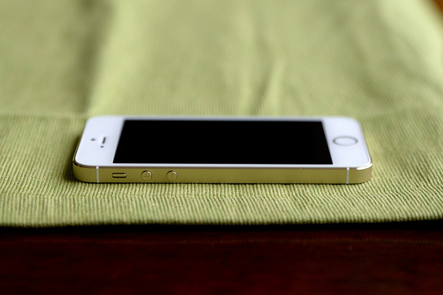
Photo Credit: Ashok Govind
Enjoy this post? Read more like it in Tutorials.