
Follow the best form design practices
By team on October 7, 2024
Designing effective forms is essential to increasing user experience, generating leads, and promoting conversions. You have all the resources you need to design forms that are easy to use, visually appealing, and functional with Happyforms and The Theme Foundry. To assist you in creating polished, business-like forms for your WordPress website, we’ll go over five best practices for developing forms with Happyforms together with The Theme Foundry in this blog post.
Best Practices make forms Perfect!
- Keeping it Simple and Straightforward
The easiest forms for users to complete are the finest ones. Form completion rates rise when forms are simple to use and guarantee that users are not overwhelmed.
- Limit Form Fields: To save labor and user fatigue, only ask for the information that is necessary.
- Organize Logically: To establish a smooth flow, group related fields together.
- Use Clear Labels: Users will be able to understand exactly what information is needed.
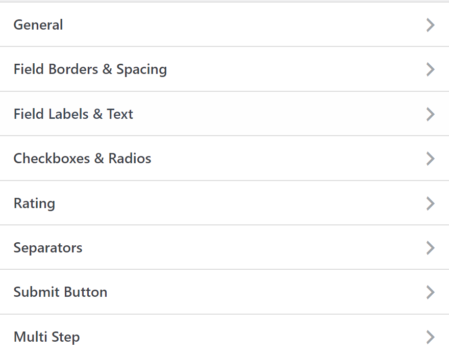
- Match with the Site’s Theme
A well-designed form should fit in with the overall layout of your website, giving visitors a unified and consistent visual experience.
- Color Coordination: Coordinate the form’s color scheme with The Theme Foundry’s primary and secondary colors.
- Button Styling: Customize your submit buttons to stand out while maintaining consistency with the overall design.
- Padding and Spacing: Use ample white space between fields.
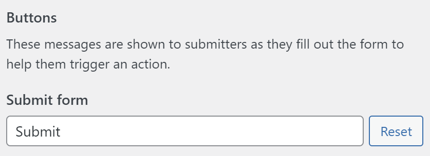
- Add a Clear Call-to-Action
The submit button on your form should clearly communicate what the user is doing.
- Use action-driven Text: Put some useful words on the button, such “Get Started” or “Submit Request.”
- Make the Submit Button Stand Out: Use a color that complements the theme of your website but contrasts with the rest of your form.

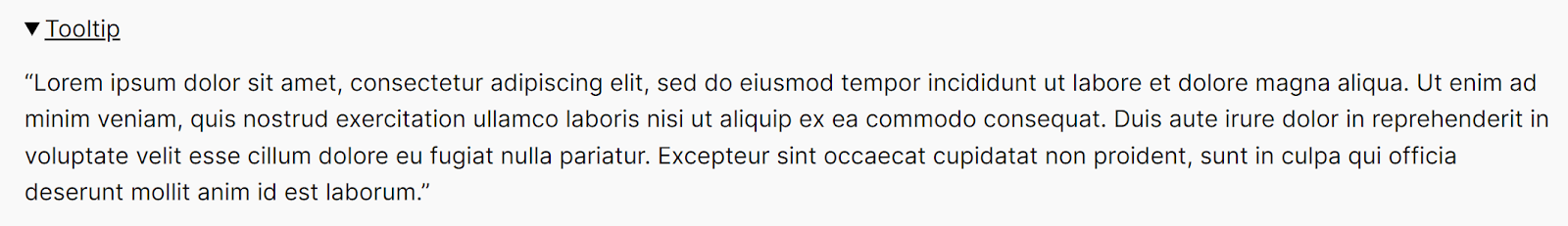
- Minimize Required Fields
Requiring too much information might be burdensome and decrease the number of forms submitted.
- Only ask Essential Information: Keep the number of essential fields to a minimum.
- Include Tooltips: Give consumers information in fields where they might require it.
- Testing Before Launching
It’s crucial to test your form before it goes live to make sure it looks fantastic and works as intended.
- Cross-browser Testing: Examine the behavior of your form in various browsers.
- Functionality Test: Make sure all fields and buttons work as expected.
- Form Submission Test: Make that form submissions are emailed, stored, and integrated with your CRM appropriately.
Let’s Wrap Up
These practices can assist you in creating forms that improve user experience, guarantee accessibility, and blend in with the aesthetics of your website. Reduce the number of needed fields, include a call to action, keep things simple, make sure the design is consistent, and test everything before releasing it.
Try Building with Happyforms Today!
Download Happyforms plugin for free and create effective, user-friendly forms for your website in a matter of minutes. Happyforms will improve your WordPress experience, whether you’re handling surveys, generating custom forms, or gathering leads!