Don’t steal my WordPress theme options
By team on December 20, 2011
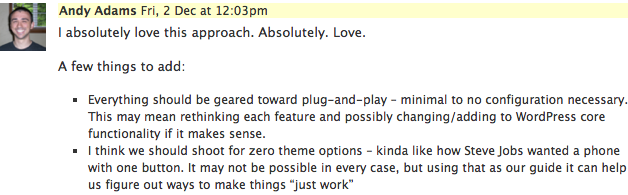
Here at The Theme Foundry we take the craft of WordPress theming seriously. We’re constantly scrutinizing everything: how we code the themes, what features we want to add, and ultimately what features we need to leave out. While developing our latest theme Duet, we had some passionate discussion about WordPress theme options.
There are some themes that are designed to serve nearly any purpose under the sun – and they contain a vast amount of configurable options on the backend to help you get your site “just like you want it”.
On the other hand, there are those who say themes should have zero (or as close to it as possible) options – the idea being that a theme should “just work”.
At The Theme Foundry, we tend to lean toward the “zero configuration” side. We think requiring extensive backend setup is a turn-off for the average user, so we gear our themes to work “out of the zip”.
With that in mind, I’d like to share a story with you about some lessons I learned while building Duet.
Developing a philosophy
Personally, I’m relatively new to the WordPress theme space. As I’ve read over various WordPress development blogs and news sources, I’ve found that there seems to be a general outcry against too many options. Some of the best WordPress themes take a more minimal approach to theme options. Andrew Nacin wrote recently about “learning to decide” instead of just adding another option.
Death to options!
Such a compelling rallying cry – the thought of a theme that “just works” without a single configuration option seemed like a crystal-clear light to guide the way! I loved the principle so dearly, that during a company discussion, I suggested that we gear our efforts towards eliminating all options:
Talk is cheap…
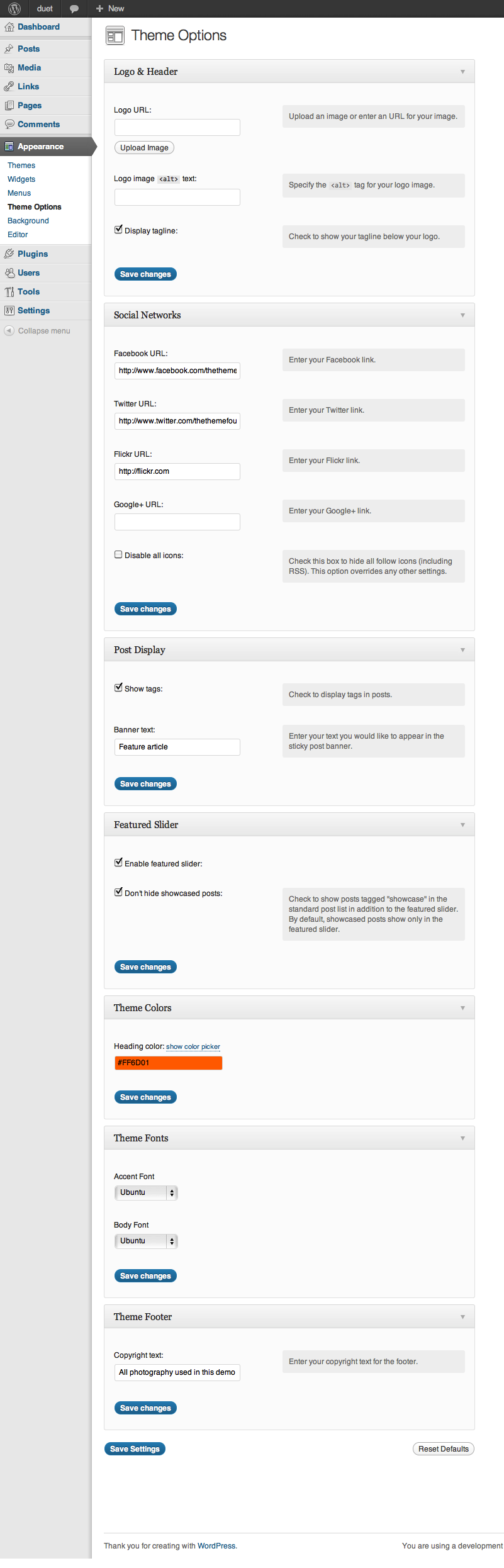
The team rallied around the idea – we’d take a hatchet to options! At the time, we were working on our most recent release, Duet. Scott’s design was focused on typography and a beautiful reading experience, and it had a number of options to tweak the appearance. Duet’s options page looked like this, fully expanded:
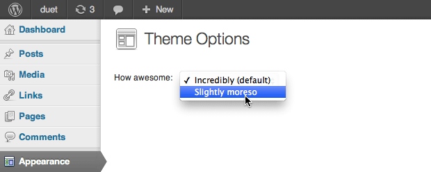
We talked it over, and decided we’d go one-by-one through the options and scrutinize like madmen. Anticipating massive option slaying, we pictured the “after” screenshot to look something like this:
The Ethos of the Logos
Energized behind our new philosophy, we started with some substantial victories in the Logo Options section.
![]()
We asked: Do our users have any need to modify the alt text of their logo image?
The answer: No. Of course not – the site title works wonderfully as the alt text (this is for their logo, after all). Chopped.
We asked: Do we need an option to toggle the tagline display?
The answer: No. The tagline is only used in the header, and if the user wants to remove it they can simply remove their tagline in their settings. Any more complicated tagline requirements they have can be handled through template modification and/or CSS changes. Consider it chopped.
Boom! Two options down right out of the gate. We were feeling pretty good at this point, and our strategy looked promising. But (you knew this was coming), as we started trying to chop some of our other options, we found ourselves at a bit of a crossroads.
Color me unconvinced
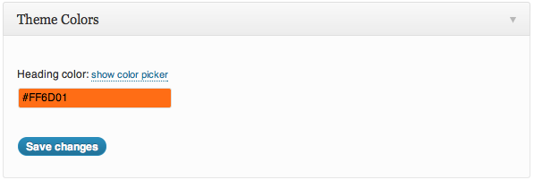
The headings in Duet were a nifty orange color by default. Knowing that orange doesn’t suit everyone’s taste, we originally included an option for toggling the color of these headings to a color of your choosing, using a hex value and a color picker.
Then, we asked: Is choosing the heading color something a user should have to deal with?
The answer: No – but they need to be able to switch from orange. As theme designers, instead of leaving the user to try to find something that looks nice, we should be be providing some awesome choices that are stunning out of the box. It’s all about making the best decisions for the user, not adding options.
We decided to come up with some color schemes to choose from, which offered a few big advantages:
- Users didn’t have to mess around with hex color codes, trying to find a good fit.
- We could add additional colors to compliment the main.
- We could change the featured banner color (which uses image CSS pseudo-elements to get the banner effect) to compliment the color scheme.
Our slash-and-burn philosophy was starting to hit reality – and believe it or not, I started to feel a little anxiety. I wanted desperately to chop our options down to the bare minimum, and I suggested ways to get rid of the option:
- Provide tutorials on editing CSS that would show users how to modify their color schemes and select good colors.
- Include the banner elements as PNG and PSD files so users could make their own.
Drew and Scott quickly reminded me that requiring users to make modifications to their theme is a less than ideal experience. They weren’t buying it, so we kept the option.
So, after our changes we still had an option – but we felt it provided a better experience and prevented the user from having to make a nuanced design decision (that’s our job, after all) – instead, they had 3 lovely choices. I wasn’t thrilled, but I was overruled and we moved on to the next option for review.
The great reversal
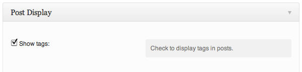
Scott had included an option to control whether or not the tags would display on a post. If the user checked it, all tags would be hidden from all posts – aha! Something that could be easily controlled using CSS or a small template modification – victory was mine!
We asked: Do our users really need to be able to hide the tags on their posts?
The answer: No. Except that this is one of the most-requested modifications on any of our themes. Some people use tags, some people use categories, some use neither, and some use both. Hiding one or the other is useful to many of our users, and that’s something we’ve learned only through experience. It could be omitted, but we would then have to instruct users on how to modify the templates to remove tags or categories (not easy for the average user).
So, the real answer: Maybe…?
This was a toss-up. The option wasn’t necessary, but experience told us that a toggle option would probably improve the user experience. At this point, I was actually going through a bit of cognitive dissonance.
On one hand, I wanted options to die. On the other hand, I realized that these options were born out of real use cases. I knew this because I handle requests for removing categories, tags and authors on a daily basis in support. Modifying template files is difficult for many of our users, and hiding via CSS is not a very clean solution.
In addition, we sell our themes on WordPress.com – where users are unable to modify their template files, and CSS changes cost extra.
We left it in, and actually added a toggle for hiding the author and categories as well. It was sorta painful, but I was beginning to realize the flaw in my philosophy: It’s not about eliminating options, it’s about having the right options. I know, I know – hardly groundbreaking. It’s been said before by many wiser people than myself. But it’s very easy to get caught up in a philosophy without considering the real goal, which is making a pleasant experience for your users.
Don’t steal my WordPress theme options
And this is why I wanted to write this post – to counter-balance the anti-options, anti-configuration sentiment. It’s too easy to get caught up in a cargo cult – I know I did, briefly. Instead of making a theme either fully-customizable or configuration-free, I’ve realized that the ultimate goal is to add “just the right options” to make the user experience more pleasant. I think everybody would agree with that sentiment – but it’s easier said than done.
We continued through our options page, scrutinizing each one and considering ways to improve. We ended up reorganizing many options and adding a few (crazy reversal, huh?). Here’s what we ended up with, final (left) vs. original (right):
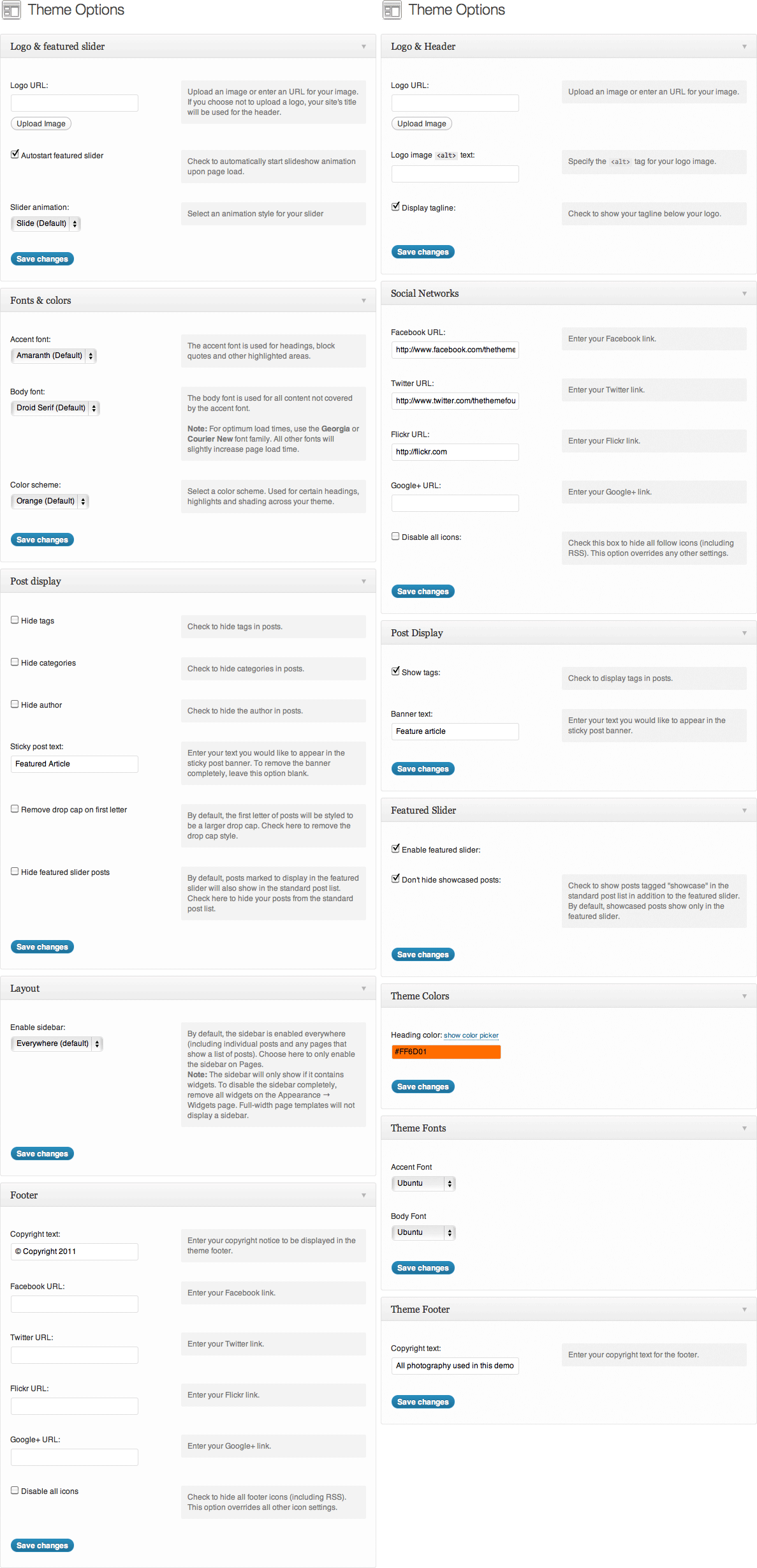
We actually ended up with more options (19 vs. the original 16). Many of our original options remained, though some were tweaked to be clearer. We added an option to control the drop cap styling on posts, since Duet is all about beautiful typography and we anticipated not everyone liking this aspect. Finally, we added some slider options that are commonly requested on our other themes.
And that brings me to the end of my story, a tale of a developer (and a team) who went from loving, to hating, to having a mutually beneficial relationship with options, all in a matter of weeks. It was a tremendous and rapid learning experience for all of us. We still have a lot to learn, but we’re making strides in providing top-notch experiences with each of our themes.
Enjoy this post? Read more like it in From the workshop.
