Checklist for WordPress theme typography
By team on December 2, 2014
Web typography baffles many business owners and WordPress developers. What fonts and font layouts are most appropriate in a WordPress theme – and how should you evaluate the plethora of options at your disposal?
While there isn’t a catch-all solution to the typography question, one thing is certain: typography should help your readers to obtain value from your written content – not discourage them. To identify typography meeting that specification, pay close attention to the following:
- Readability: Reading your content should never be a struggle. It should be effortless and natural.
- Appearance: Typography should have a clearly defined hierarchy, contrast, and spacing among content areas.
- Errors: Some themes omit, overuse, or combine certain typographic styles. You should avoid themes that do this.
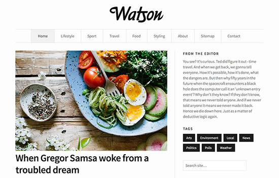
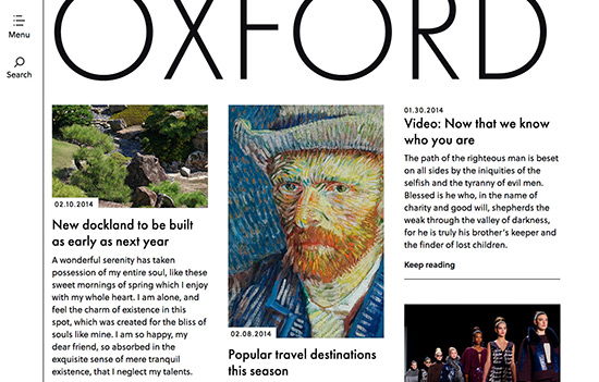
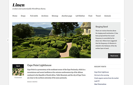
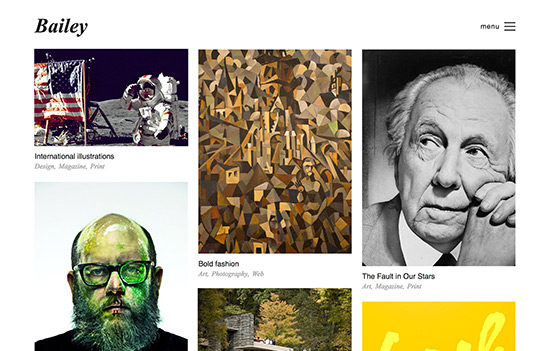
Think of these issues as a checklist where each item informs the quality of a theme’s typography. When you’re evaluating WordPress themes, typography should always meet these benchmarks! Let’s examine each issue in greater depth so you can identify WordPress theme typography that works for your website.
1. Readability
Before thinking about styles, colors, sizes, and other typographic details, do this: read an entire post in the theme you’re considering. Then, as you’re reading, ask yourself:
- Have I lost my place in the text?
- Have I re-read sentences?
- Is reading this text difficult?
If you answer any of these questions in the affirmative, you should probably look for another theme. Effective typography won’t ever be hard to read!
To understand why some text might be difficult to read on your screen, it helps to know how people process information while they read. Reading, on the surface, may seem like a very fluid exercise with eyes moving along lines of text in a steady, linear fashion. But that’s not how it works.
When we read, our eyes perform a series of saccades – short, rapid movements – between words or groups of words. Interspersed throughout these saccades are brief pauses, or fixations, during which our brains process the information we just read.
What do saccades and fixations have to do with readability? The easier it is for our eyes (and brains) to parse character shapes, the more fluid the reading experience. Consider the difference between this:
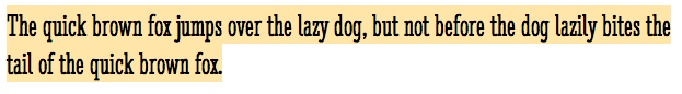
and this:
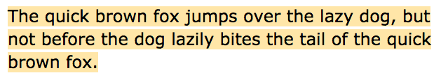
I’ll leave it to you to decide which passage is easier to read. Ultimately, readability comes down to the visual and cognitive effort required to process the information you publish. Some WordPress themes will empower readers to comprehend your written content. Others will deter them.
Assuming your theme supports it, one way to test readability is via the Customizer. Make lets you test drive over 600 fonts in the Customizer before committing to anything. You can consider how your content (i.e. not demo content) will look under various circumstances, which is an effective way to gauge readability before clicking “publish.”
2. Appearance
Appearance in typography has less to do with whether a font looks pretty – although prettiness, while subjective, isn’t a bad thing! – than with how various typographic elements coalesce to yield a complete document. Important issues include:
- Hierarchy: Headings should have a distinct style and should make it easy to understand how content areas are grouped.
- Contrast: Body content should have a different size from headings (smaller) and may even appear in an altogether different font.
- Space: The spaces between words, characters, headings, captions, and content sections should be definitive as space contributes to the overall appearance of a theme’s typography.
Themes with distinct hierarchies, definite contrasts between headings and body content, and appropriate uses of space will encourage effortless readability and minimize the risk of alienating readers with bad typography. Appearance matters!
If you know how to edit your theme’s stylesheet and aren’t shy about experimenting with different font sizes and heading-to-body content ratios, check out Modular Scale, a tool that helps you determine the most ideal proportions between text sizes. Its creator, Tim Brown, also does a good job explaining how to use these proportions in your theme’s CSS.
3. Errors
Always strive for error-free typography. Errors will make your copy cumbersome, unwieldy, and generally unpleasant to read. Common typographic errors include:
- Large or small leading: This is when lines of text are too far apart or too close together.
- Overformating: This includes combining bold and italic, underlining all of the bold text, and so on. Generally, bold should be bold and italic should be italic.
- Styling omissions: Some fonts might not look much different when you italicize them, and that’s a problem, too!
All in all, a theme that includes typographic errors probably isn’t very well designed. When examining typography, be sure you’re looking at a theme’s text in every stylistic form and confirm that it looks, feels, and reads the way you would expect it to.
Did you check all three boxes?
If your theme displays clear, readable, error-free typography, you’re good to go! These are the the three critical items on your typography checklist, and your theme includes all of them.
In the event your WordPress theme doesn’t use effective typography, you should consider whether it’s possible to modify it or change to a theme that’s more appropriate. The better your typography, the easier it is to communicate with your audience.
Did you evaluate these issues before choosing your last WordPress theme? Tell us if you did, and let us know what else you think is important for identifying good typography!
Enjoy this post? Read more like it in Tutorials.