You’ve chosen one of our themes and are ready to upload graphics to your website, such as a logo, banner, or some photography shots. But before you continue, you’ll need to make sure your images are correctly cropped and optimised – and this the perfect post to help you. We’ll discuss why you need to crop and optimise images before uploading them to WordPress and the importance of saving your photos in a suitable file format.
Let’s start by covering the basics.
Image optimisation is when you reduce the file size of your image without losing quality. To reduce the size of the image, you’ll need to resize it. Image resizing can be done by either cropping or scaling.
If you need the size of your image altered, why not just go for cropping? Well, cropping can reduce the size of your image, but it’ll change the proportions of the entire image, and you can lose valuable image data. That’s why you should only crop your image to reduce its size when you wouldn’t mind losing parts of the picture.
Scaling is the best way to optimise an image because it lets you fit the exact requirements of your application. Scaling keeps the image dimensions intact, you don’t have to cut off any parts of your image, and it allows you to reduce your file size without having to sacrifice the quality.
An overview of image properties will help to understand the process of resizing and optimisation better.
Properties of an image
A variety of things determines the size and quality of an image for use on a web page.
- File Size
The file size of an image is how much storage space it takes on the server or a drive. The lower your image file size, the less time it will take to load on your page. Keeping an optimum file size is key to creating a suitable web page because an extra small image file size will lose quality and a too large image file size will take too long to load.
- Physical Size
The physical size of an image is a combination of its size on the screen and its file size. The physical size determines how much total space an image will take on any page. If your WordPress theme has a fixed width sidebar and you use an image that occupies too much screen space, it will push the rest of your content to the side. It can ruin the layout of your entire page, which is why it’s necessary to pay attention to the physical size of your image.
- Image Resolution
The resolution describes the number of pixels found in an image. It is usually a description that includes the width, height, and the total number of pixels in an image. Pictures with higher resolution have more clarity and vice versa. However, an image with a large resolution value would increase its file size, again making loading and storage an issue. This is where you have to decide how you’ll balance file size and quality.
- Image Format
The format of an image is identified by its extension, which comes at the end of the file name. There are a bunch of image formats you’ll find such as JPG, JPEG, PNG, TIFF, Exif, and GIF. Each image format has its distinct properties, pros, and cons to use for different applications. Don’t worry, we’ll discuss some popular image formats and their main features in the following section.
Popular image formats
It’s easy to see now that your image files are influenced by two key factors — file size and quality. Therefore, optimising your graphics is a game of balance: file size affects how fast your images will load; quality determines how your photos will look to your readers.
Although there are many file formats out there, we’ll focus on three of the most popular ones that are found on the web today.
- JPG
Compression
JPG (Joint Photographic Experts Group) is a lossy file format.
Applications
The JPG file format is best for saving large photographs or banners.
Benefits
Since JPG is lossy, the file size is usually small.
Drawbacks
There are a few drawbacks to this file format, such as the fact that it removes detail from a photo and doesn’t support transparent backgrounds.
- GIF
Compression
A GIF (Graphics Interchange Format) has lossless compression.
Applications
The best application for a GIF image is when you need to store graphics with very few colors e.g., shapes, logos, cartoons, or simple diagrams. Its animation capabilities are widely used nowadays for creating animated GIFs.
Benefits
This file format is simple and is supported by almost all types of software.
Drawbacks
GIF images aren’t suitable for photographs or pictures that need high quality.
- PNG
Compression
PNG (Portable Network Graphics) is a lossless file format.
Applications
This file type is excellent for both photographs and simple line art. PNG files are perfect for logos, buttons, small background textures, and other such interface elements.
Benefits
PNG files have great image quality, and they have the feature of transparency.
Drawbacks
While a PNG image is of high quality, it also has a larger file size. Additionally, some older browser versions don’t adequately support the file format.
Now that we’ve gone through the most fundamental image properties, it’s time to find out why exactly we need to resize and optimise.
Why is resizing and optimisation important?
Maybe your images aren’t appealing enough, or your photos load slowly. Cropping, resizing, and optimising your images properly will fix both problems. Mastering — or, at least, learning — these techniques is an essential step in building a successful WordPress site. You’ll create better visual content, speed-up the uploading process, reduce bandwidth usage, and shed inessential bytes from your graphics files.
The following are some key points explaining how the wrong image size can affect your website.
- Large images can slow down your site
Loading large sized photos takes time, which is why if you use images that have too big dimensions, they’ll considerably reduce your site’s speed. When you use optimised images, your webpage will load more quickly — and readers love speedy sites.
- Oversized images take too much server space
Unless you have an unlimited amount of server space available, you need to cater to the amount of storage your media files take. If unnecessarily large image files take up most of your WordPress storage, it won’t leave any room for other essential files. Your server will become overfilled, not to mention slow, very quickly.
- Your theme might not work properly
Majority of WordPress themes are optimised specifically for a range of image sizes. If you upload images whose dimensions fall out of that range, chances are, your theme will not appear like you’ve expected it to.
To sum everything up nicely, here are the benefits of accurately resizing and optimising your images:
- Easy and quick uploading (and downloading)
- Your website will load quickly
- Reduction in bandwidth usage
- You’ll have better visual content
- You’ll save server space
- The images will fit perfectly in your theme
Why use a photo editor?
There are a few ways you can resize and optimise your images for WordPress, but using a photo editor is by far the quickest and most efficient method. Almost every photo editor you find will include tools for cropping and resizing images.
Before uploading an image to your site, search for an easy-to-use photo editor either online or as a downloadable PC software. Usually, both types of software are very straightforward to use, and they’ll give you good results. Using an online photo editor is an excellent option if you’re looking for a tool that’s easily accessible yet powerful.
Some photo editors also give you the option to “batch edit” your images, which means you get to apply edits to multiple photos at once. This can be utterly useful if you need a large number of pictures edited – much better than having to edit each image one by one.
An example
Now that we’ve discussed photo optimisation, standard file formats, and picture editing, let’s walk through an example.
Before we start, it should be noted that all of our themes auto-crop and scale to fit your images to content areas such as the Featured Slider and Featured images. We also include important image dimensions within each of our theme tutorials to help you pre-crop your photos.
Let’s use the case of the Canvas Prints Free Photo Editor, which is a free online image editing tool by the Canvas Prints. The following tutorial includes the example of the Canvas Prints Free Photo Editor, but feel free to use your preferred image editor.
Let’s crop a photo to use as a Featured image in our Portfolio theme. First, I’ll check the theme tutorial for the correct dimensions. The documentation specifies a width of 860px and a recommended height of 450px. In this particular case, the height is only recommended and can be adjusted to your liking.
Step 1: Open
After reaching the editor website, we’ll choose the that we need to edit. Once the picture is uploaded, the photo editor launches.
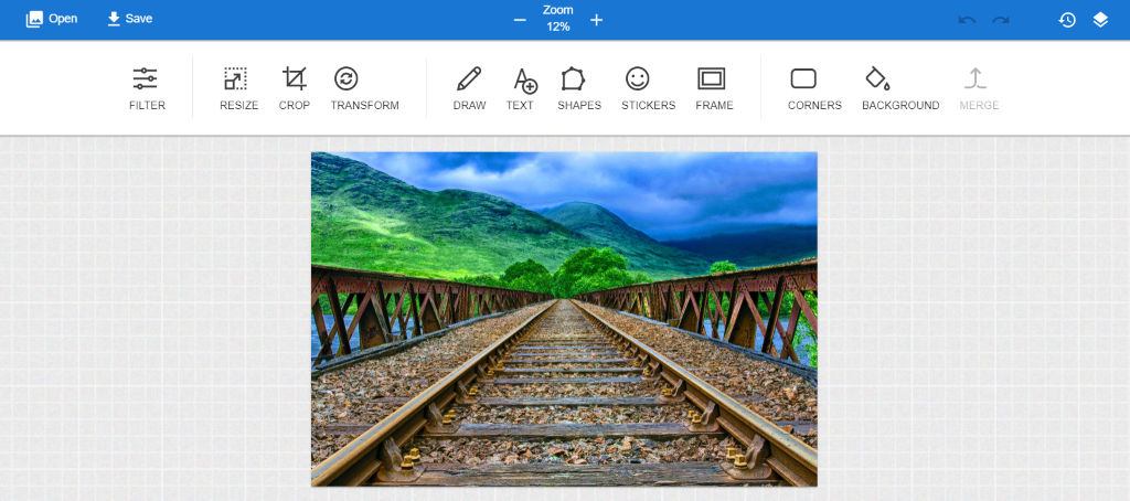
The image I’ve chosen for this example is 4920 x 3251 pixels. If you need to find high-quality stock photos for your website or blog, you can check out this list of best free stock photo sites.
Step 2: Resize
If you’re working with photographs from your camera, the chances are your images are going to have enormous dimensions. These large image dimensions are great for print, but in most cases, smaller sizes are better for the web.
We only need to cater to the width dimensions of the image, since the desired theme specifies a width but only recommends a height. Once you’ve opened your image and are ready to start editing, navigate to Resize from the top menu bar and make sure to select Maintain Aspect Ratio.
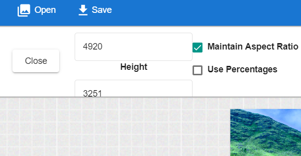
Enter the required width dimension, which in this case is 860 px, and don’t worry about the height because it’ll be adjusted according to the aspect ratio.
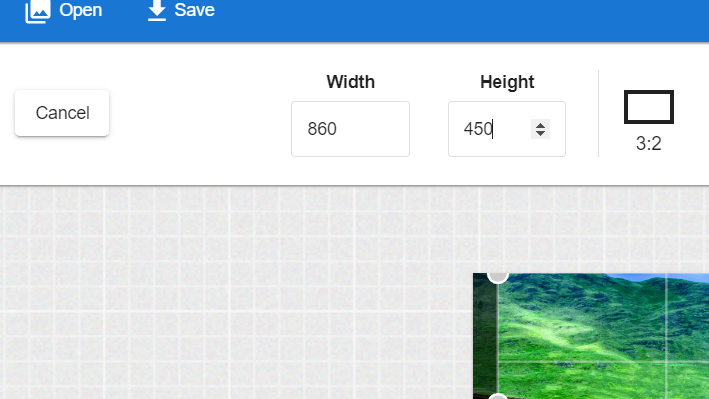
Once you’ve resized your image’s width according to the requirements, it’s up to you to resize the height. If you choose to do so, select Crop from the main menu bar and then enter 450 px value in the height option.
The photo is now according to our required dimensions for the theme.
Step 3: Save
Now that your image is resized, select Save from above the main menu bar to save it to your computer.
Step 4: Upload
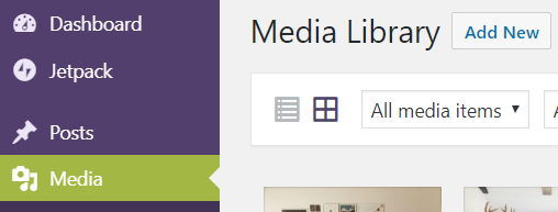
Now it’s time to upload this image to WordPress. Within your WordPress dashboard, navigate to Media → Add New. Upload the edited image to your media library.
Then, click to edit one of your pages. Under the Featured Image panel, click Set featured image. Select the image from your media library, then, under the Featured image on Detail page option, select Full Image. Selecting this option displays your image at its maximum dimensions (860 × 450).
Update or Publish your page and view the results.
You now have a resized image, which fits perfectly in your theme and will load much more quickly than the original file.
More software you can use
We’ve gone through the process of resizing an image using the Canvas Prints Free Photo Editor, but there are tons of other tools available. Here are three of the top image resizing and optimisation programs that can be easily found online:
1. BeFunky
With BeFunky, you can quickly resize your photos by changing its height and width, or by altering the percentage scale. If you only want to change the width or the height, PicMonkey adjusts the other parameter accordingly.
2. B.I.R.M.E
B.I.R.M.E. (Batch Image Resizing Made Easy) is a wonderful option for bulk image resizing. The best part about this online photo editor is that it provides a preview of your images before you can save them, so you’re able to see if you’re satisfied with the results.
3. Rszr
Rszr is a free online tool which lets you easily crop or resize your images. It’s fast, simple, and very effective.
Resizing and creating the most optimum images has a lot of advantages. It’s reasonably easy to use an online tool such as the Canvas Prints Free Online Editor to resize your image for a WordPress theme.
You’ve also learned the basics of image types and properties, and what optimisation is all about, now it’s time to get busy resizing and showing off your images!
PS: If you’re looking for even more, check out Jon from EngineScout’s “must read” WordPress image sizing guide.


